NiFi Template Viewer
This is a live GitHub Pages site so please take a look!
What is NiFi?
NiFi is a low-code tool for moving and flowing data. It provides a way to easily glue software together by routing inputs and outputs between services, and brings along a suite of features for observability, reliability, and management. NiFi is a flexible extract-transform-load (ETL) tool.
Viewing examples
NiFi data flows are saved as XML Template files. There are a few places to find example NiFi flows. For example, the official examples and various GitHub repositories.
Sounds convenient enough… and now you want to see these examples look like?
Okay then, you’ll need to do the following:
- Download the XML template file
- Spin up a NiFi docker container or access an existing NiFi cluster
- Make sure any extensions used in the template are installed
- Load the template file into the running NiFi
While it’s definitely workable, it could be a lot less tedious to view example NiFi templates.
The Web Viewer
In order to better explore NiFi templates natively on the web, I decided to create a web-based viewer and Chrome Extension.
Chrome Extension

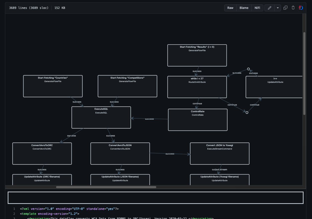
This project started out as an extension to add a “NiFi” button to GitHub files of NiFi templates. Only XML files would show the button to avoid clutter when other filetypes.
In the screenshot above, notice the added NiFi button next to blame and raw. The scrollable diagram opens above the highlighted XML code when “NiFi” is clicked.
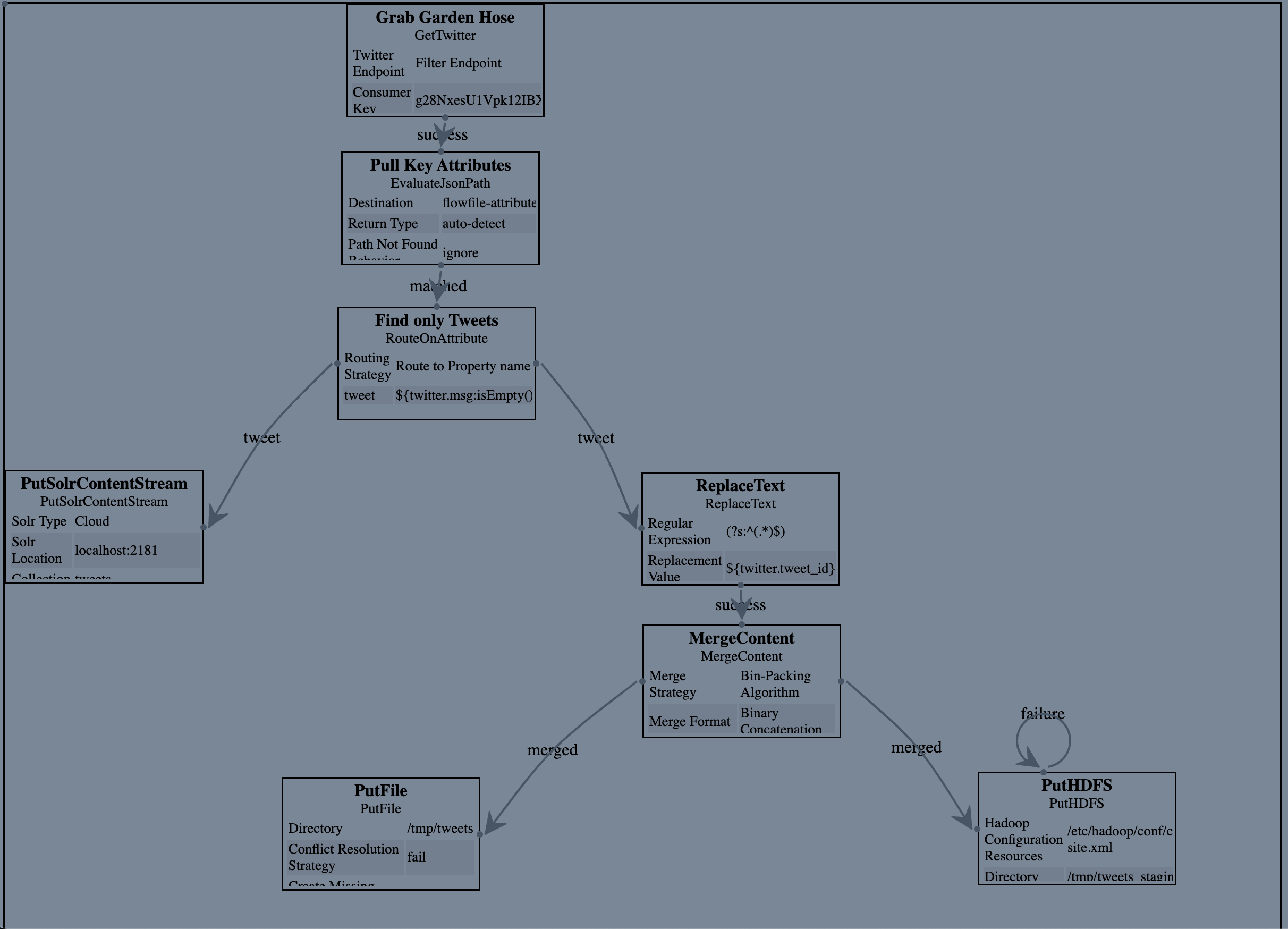
I settled on JsPlumb to display the flows in a simple dark color scheme. JsPlumb was both free (community version MIT license) and easy to use.
The extension showed the layout of NiFi processors, their names, and their relationships. Zoom and panning were also added for easy navigation. Loading was a bit challenging. I went the lean route of listening directly to the Turbo (an SPA framework used by GitHub) events from the GitHub code viewer page.
While useful for a quick glance, learning from an example template would need to show more details such as how processes were configured.
Styling and refactor
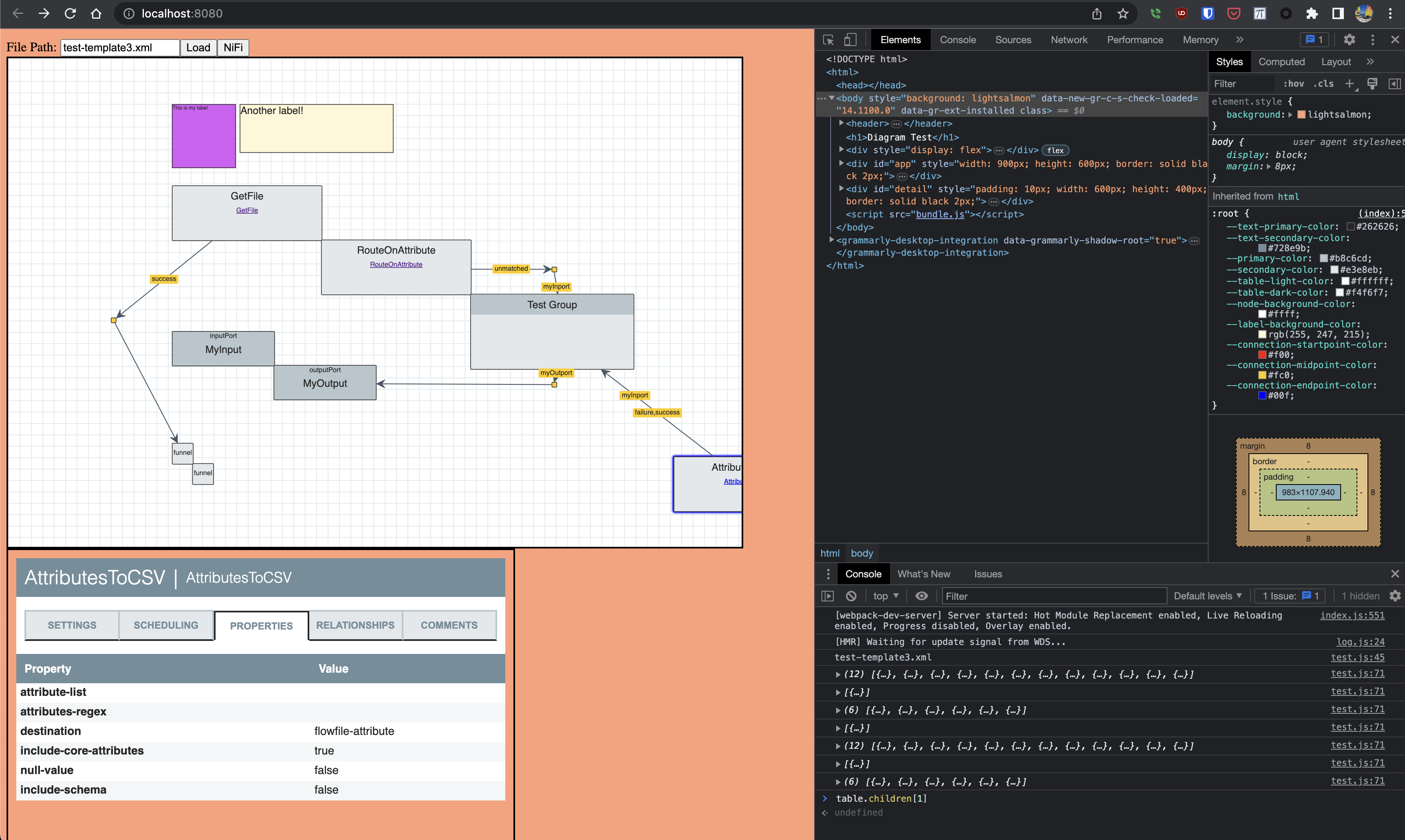
After bodging together the extension, I decided to switch gears and create a standalone page for expanding the viewer with processor details and navigation.

In the refactor, the following changes:
- Support for navigating into processGroups
- Testing and workflow was created for quick reloads
- Styling and HTML were made and broken out from parsing and graph drawing
- Parsing processor configuration data
- Support for multiple bends
- Support links to and from ports within ProcessGroups
- Parsing templates with different encoding versions are placed differently
- Drawing relationship names as labels
- Link to NiFi docs for processor type
- The one mess of code was organized into a few smaller messes of code
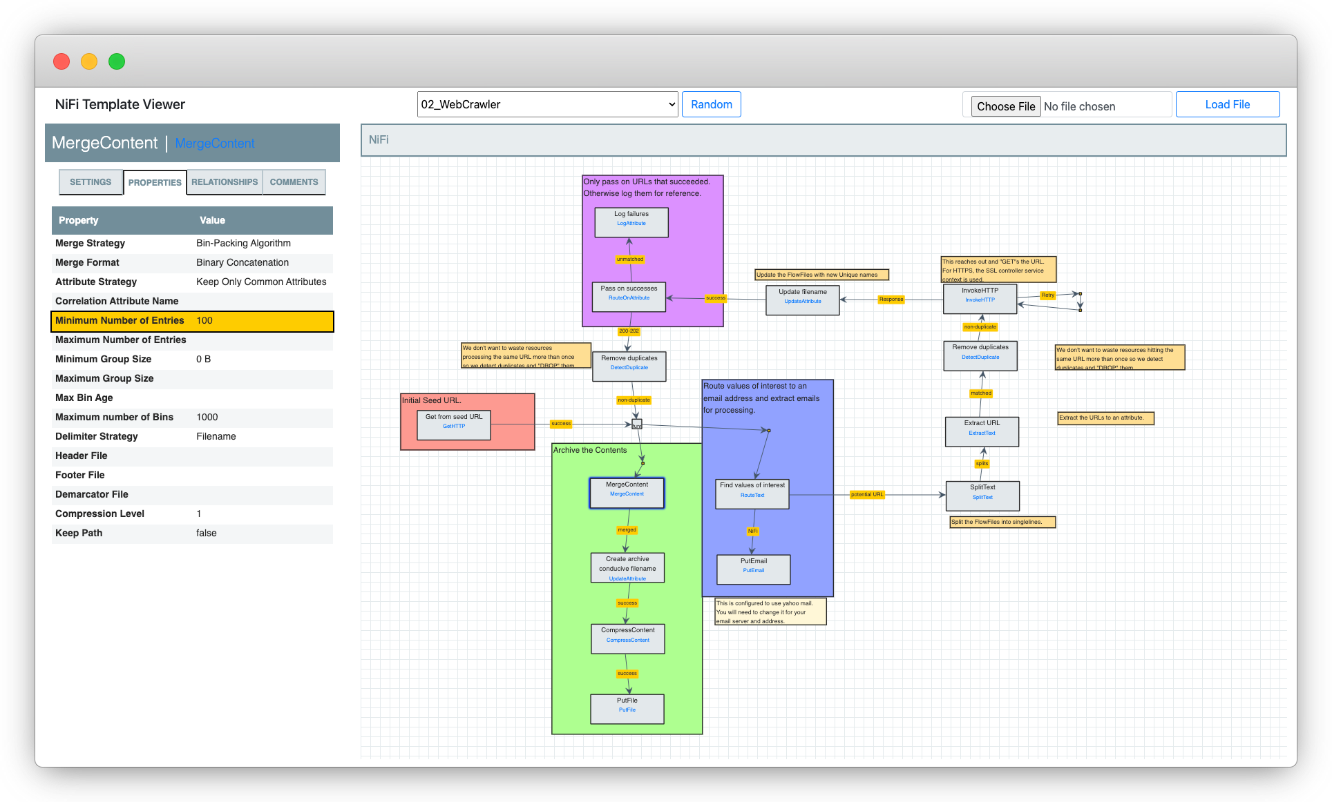
Breaking out the styling meant I was able to mimic NiFi’s look-and-feel.
In addition to the graph viewing changes, I added several components.
- Processor Details Pane
- Tab Pane
- BreadCrumb Pane

These new components provided the insights into configuration, and they were essential for enabling exploration into process groups.
I included examples and a file upload to show off what it can do. Not quite as quick as clicking a NiFi button on GitHub, but it removes the need to install the plugin.
Here’s the final result (click to navigate to the live viewer):


